Artidis is acompany that measures the cell mechanicall properties at a nanoscale. Delivers nanomechanical insights that predict metastatic potential and guide treatment decisions.
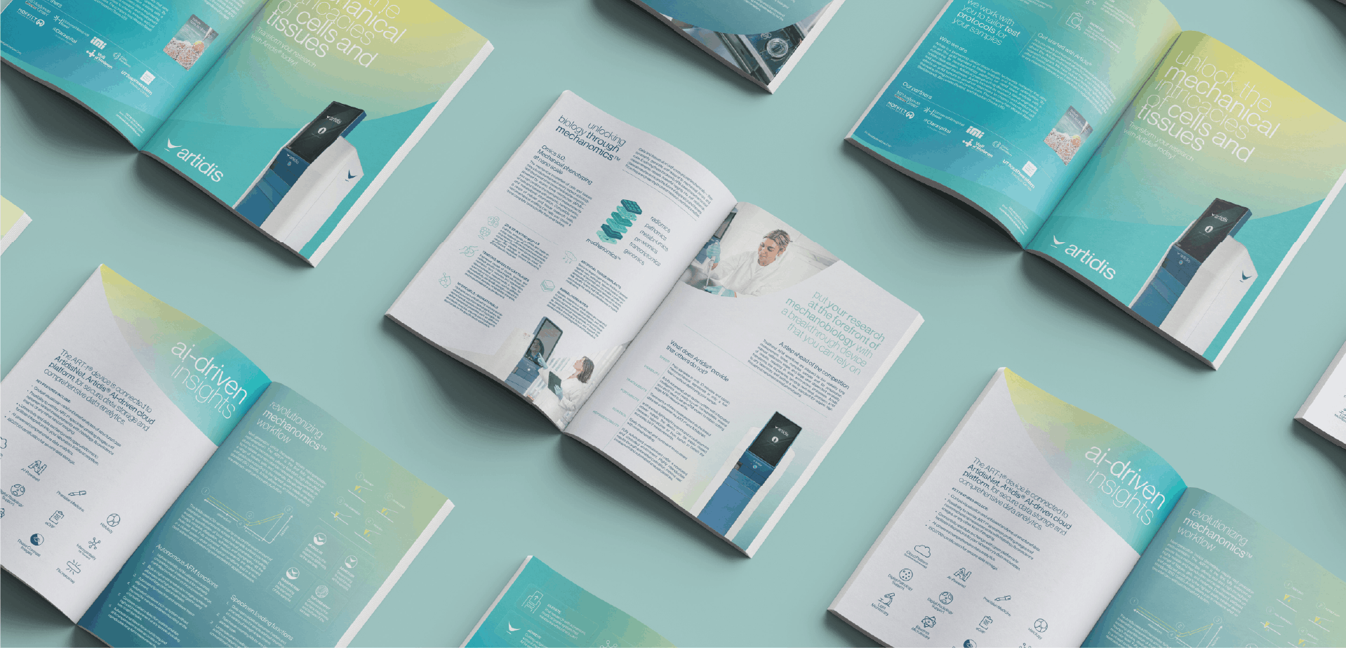
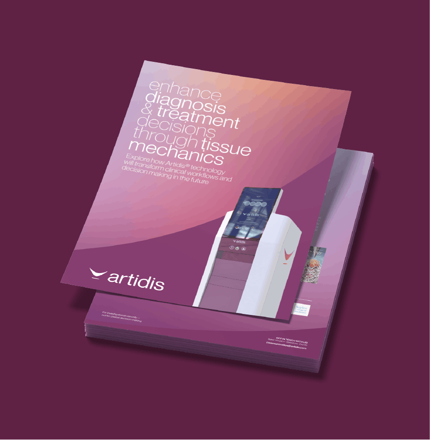
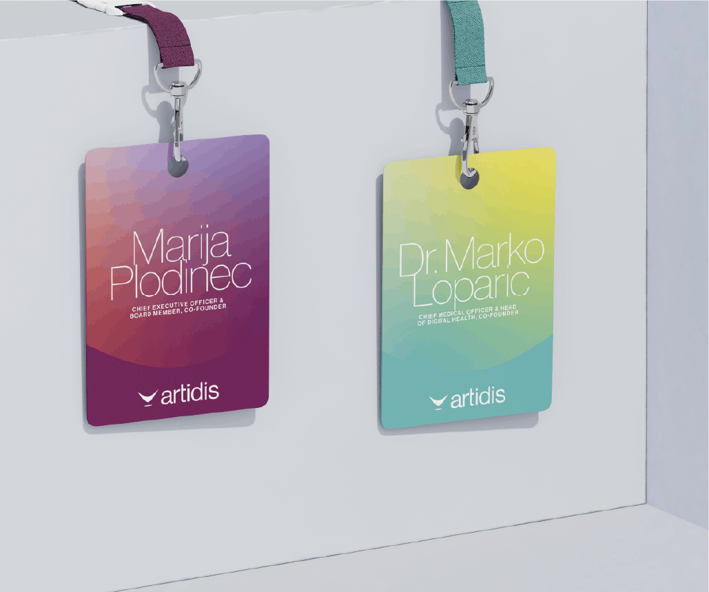
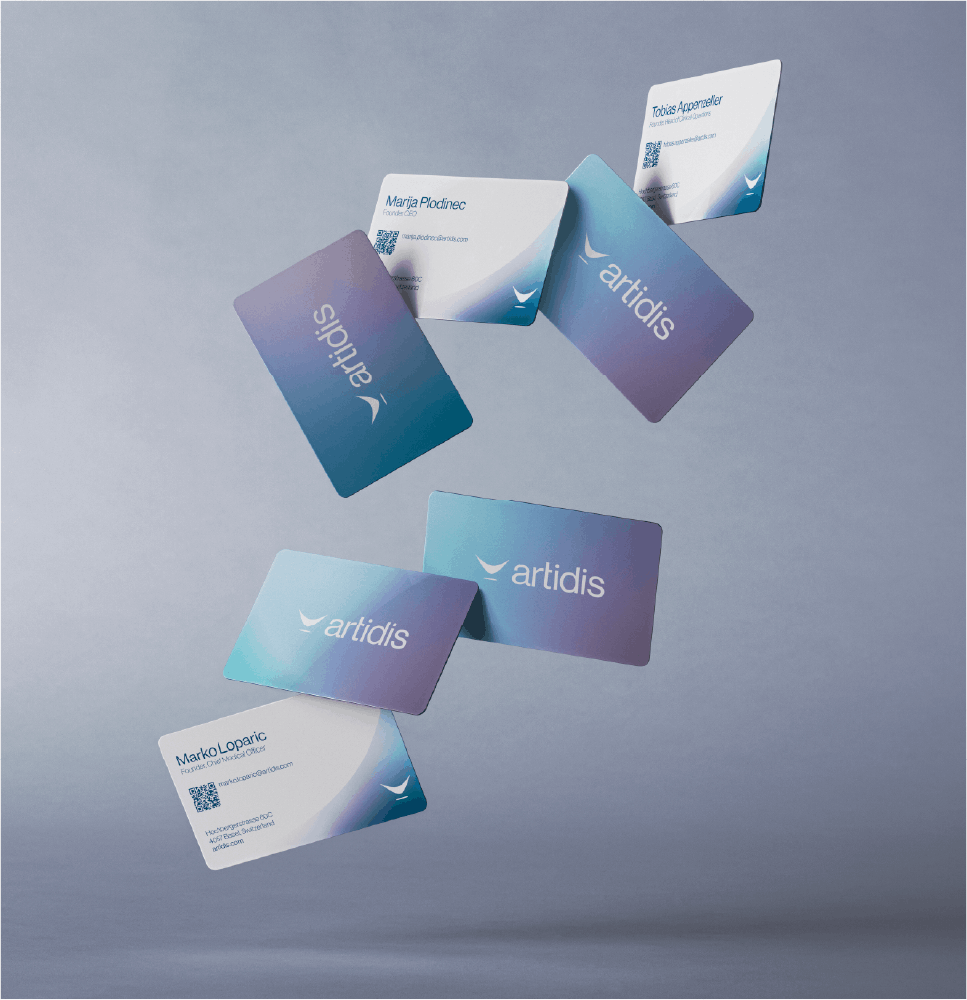
The new visual identity is conceived as a 360º project. We developed a complete rebranding that has been implemented across all company touchpoints: from building decoration and signage to brochures, trade shows, merchandising, and the website.
The goal was to create a more human-centered brand. The logo and overall brand personality are enriched with a spectrum of colors that vary depending on the specific area of activity. The gradient system allows the brand to flow and adapt, connecting naturally with patients, doctors, and researchers.
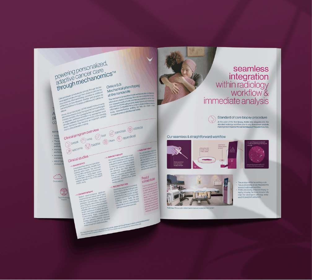
The icon system, typography, consumables design, and packaging all follow the same principle: every design element reflects the brand’s core values and reinforces a sense of care and closeness toward the patient.