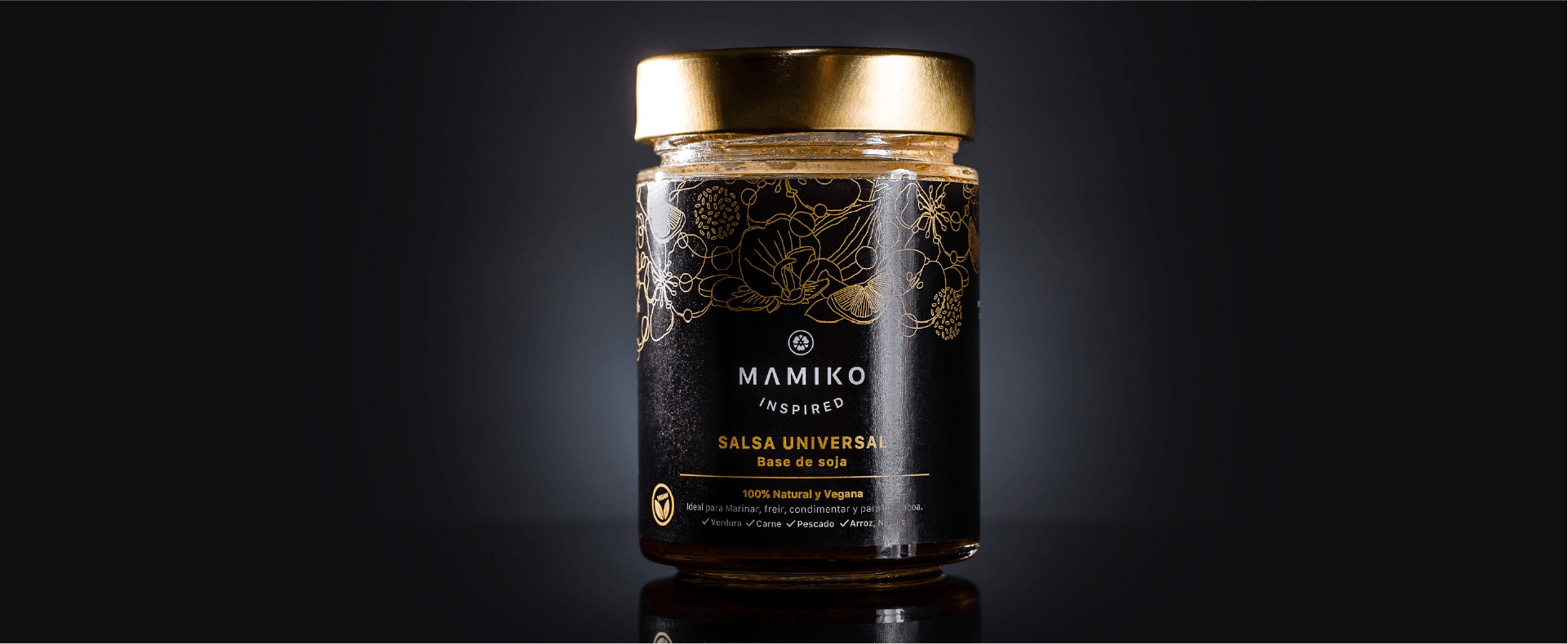
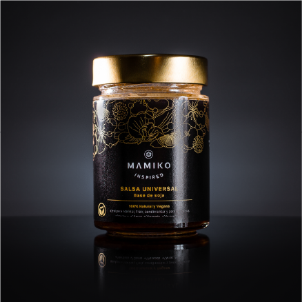
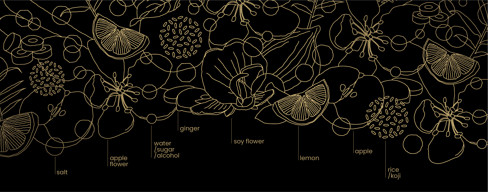
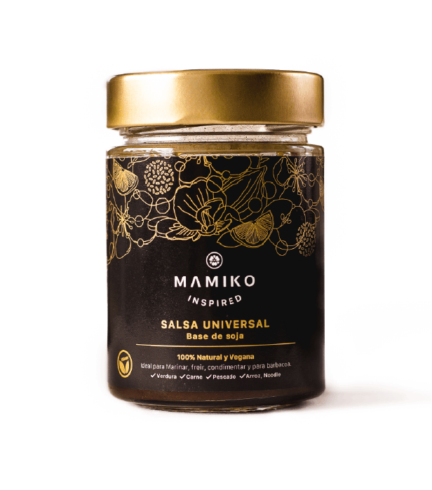
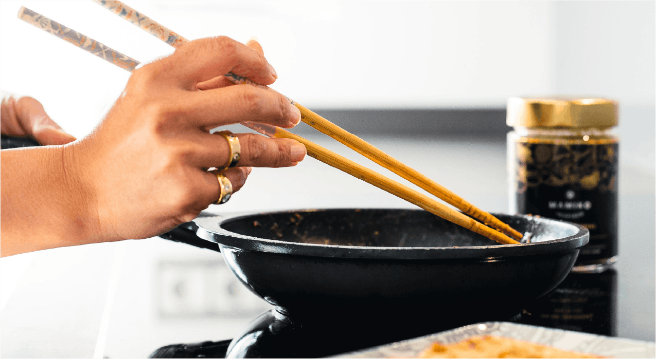
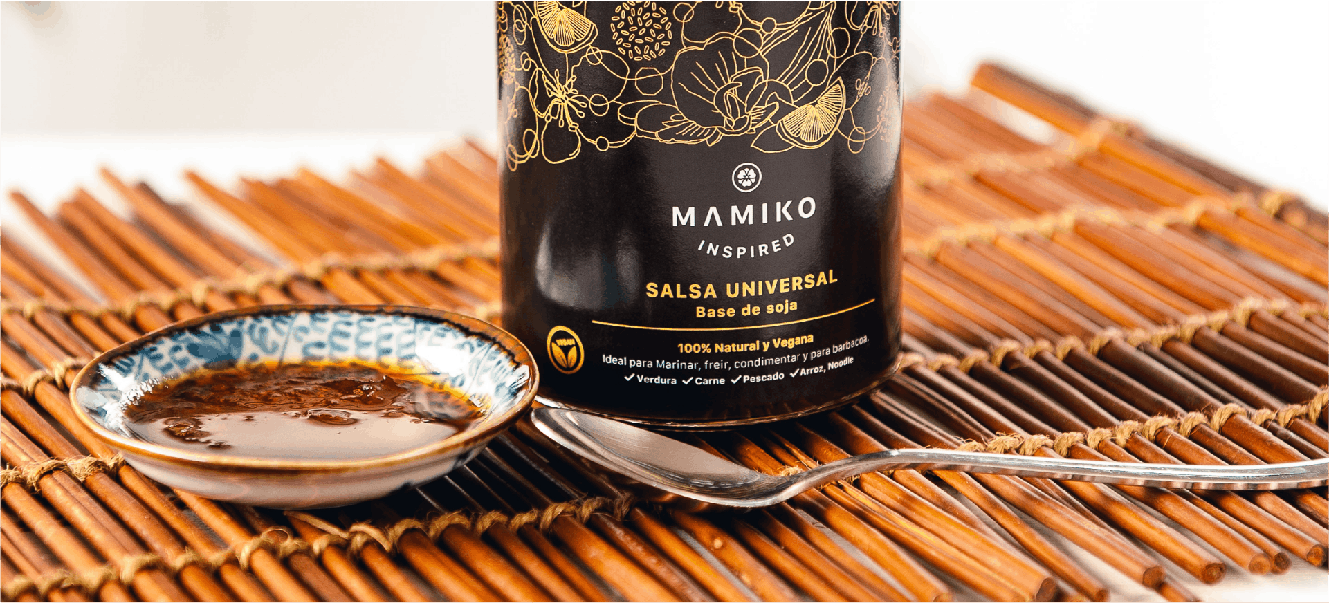
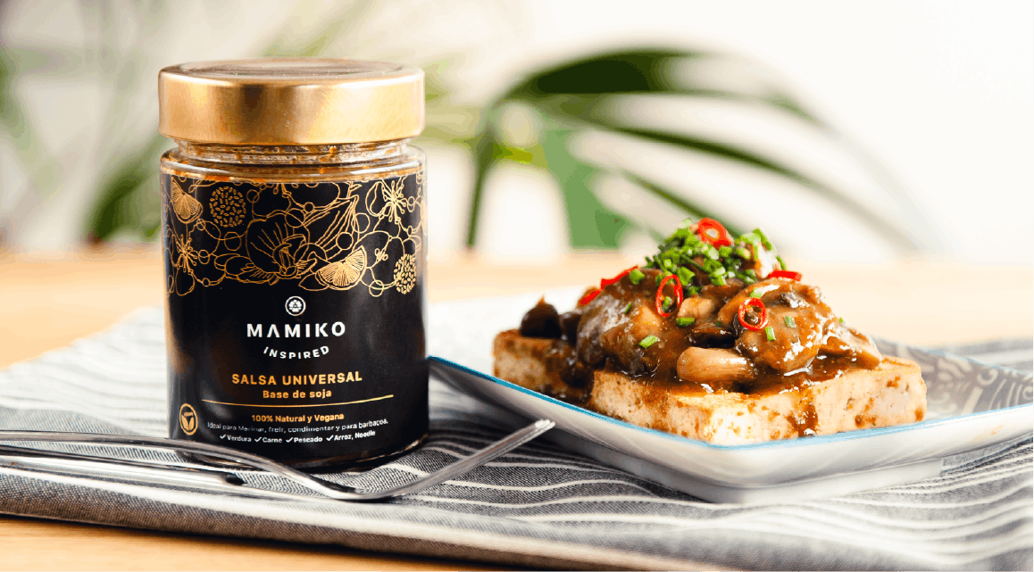
This packaging design aims to merge the delicacy of Japanese culture with Mamiko’s personality and handmade ilustrations. The visual language is built around illustrations inspired by the sauce’s natural ingredients, creating a direct connection between the product and its origins. The use of dark tones combined with gold accents enhances the perception of quality and provides a premium feel. Clear and concise information highlights the product’s suitability for vegans and emphasizes its 100% natural ingredients.
Japanese seasoning sauce
MAMIKO
Packaging design|Graphic design
This packaging design aims to merge the delicacy of Japanese culture with Mamiko’s personality and handmade ilustrations. The visual language is built around illustrations inspired by the sauce’s natural ingredients, creating a direct connection between the product and its origins. The use of dark tones combined with gold accents enhances the perception of quality and provides a premium feel. Clear and concise information highlights the product’s suitability for vegans and emphasizes its 100% natural ingredients.